Why Investors Pay Attention To The Death Cross

When looking for an edge to get a leg up on the market, some traders try to get it from technical indicators such as the moving averages of a market index. Perhaps you find your edge by poring over the balance sheets and cash flow statements of companies you’ve invested in. These are two very different approaches. One is technical analysis, the art of studying market price movements and indicators to help facilitate trading decisions; the other is based on fundamentals. Both approaches have their believers and although they may sometimes clash, using them both together has certainly been done and may in fact deliver an edge.
There are many types of technical analysis including Bollinger bands, the relative strength index (RSI), and the head-and-shoulders pattern. Today we look at a technical indicator that many investors watch called the death cross.
What’s In A Name?
No one dies at the onset of a death cross, but its ominous nickname may help you remember its significance. You get a death cross when a short-term moving average of a stock or index falls below its long-term moving average. This type of crossover can be a warning that a bear market is looming.
The opposite of the death cross is the golden cross, which can signal an imminent bull market.
When high trading volumes accompany these types of crossovers, they are generally deemed more significant. After a death cross transpires, the long-term moving average becomes a resistance level for the market from that point onward. Or in the case of a golden cross, it becomes a support level.
Time And Direction
Next, there’s the time dimension – how do you define the time frame of a long versus short term moving average crossover? It varies. Some analysts look for the intersection of a security or index’s 50-day moving average and its 100-day moving average. Others closely observe the 50-day versus the 200-day, or the 200-day compared to the 400-day.1
Although crossovers can signal a change in direction, they are generally considered to be a lagging indicator as opposed to a leading indicator. A downturn may have already started by the time a crossover occurs. This is why naysayers say a death cross is not a very reliable predictor of market declines. Still, a death cross can help confirm a pronounced, continuing trend.
What Does A Death Cross Look Like?
Here is an example of a death cross that occurred at the 200-day and 400-day moving averages of the S&P 500 during 2008. In this particular case, the two averages crossed during a bear market relief rally.
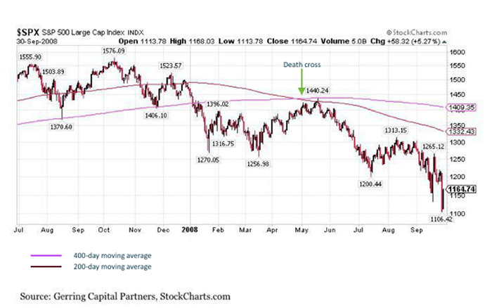
In May 2008, a death cross on the S&P 500 appeared near the peak of a relief rally. A decline in the index followed shortly thereafter. Source: Seeking Alpha. Death cross annotations in the graph added by Motif.
Most of the time, however, a death cross appears during a preexisting decline as seen below.

Death crosses are often lagging indicators of market declines. Source: Seeking Alpha. Death cross annotations in the graph added by Motif.
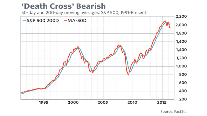
This graphic illustrates the 50-day and 200-day moving averages of the S&P 500 since 1991. Notice the recent drop in the 50-day moving average. Source: Market Watch
The most recent death cross on the S&P 500’s 50- and 200-day moving averages occurred on January 8. The index continued on a decline in the weeks after and reached a year low on February 11at 1,829.08.
In the graph below, notice the 50-day moving average remains below the 200-day, but they have been trending closer. Perhaps a golden cross – a signal of an imminent bull market – could emerge in the coming weeks. If you believe the markets are heading higher, this could represent a possible buying opportunity while the 50-day moving average remains below the 200-day.
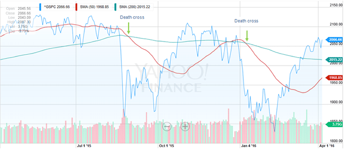
Graph source: Yahoo Finance. Death cross annotations in the graph added by Motif.
Be Wary Of The VIX
Have you heard of the CBOE Volatility Index (VIX)? It’s nicknamed the “fear index” and measures the expected volatility in the S&P over the following month. It generally moves in the opposite direction as the overall market.
As a result, a death cross in the VIX occurs when the short-term moving average breaks above the long-term – also a bearish signal. This pattern recently emerged in March.
Russell Rhoads, CBOE’s Options Institute head of education, is cautious, “The last time this happened back in 2007, a year later, the S&P 500 was down about 40 percent. For the overall equity market this could be a bearish sign.”
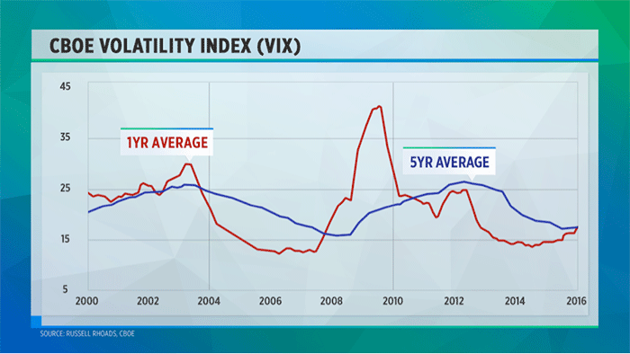
A death cross on the VIX occurs when the short-term moving average breaks above the long-term since this index typically moves in the opposite direction as the overall market. The 1-year average spiked significantly during the financial crisis. Source: Yahoo Finance
The Grand Slam Of Death Crosses
Taking things a step further, another ominous sounding technical indicator of note is the four horsemen pattern.
You get this when death crosses form on all of the four major U.S. stock indexes – the S&P 500, the Dow Jones Industrial Average, the NASDAQ and the Russell 2000. The world may not actually be coming to an end when one occurs, but the stock market may scare you into thinking it is.
Since 1979, the four horsemen death cross “grand slam” has arisen only 13 times. Analysts typically warn investors of increased volatility and potential rough times ahead when this pattern occurs.
Although indexes tend to fall in the short-term after a death cross, the results can vary. About six months ago, all four indexes had simultaneous death crosses on September 28, 2015. Fortunately, a disastrous decline didn’t ensue in the weeks that followed. The markets actually had a decent rebound in October 2015.

Although a four horsemen death cross pattern emerged on September 28, 2015, the indexes fortunately did not experience a bear market in the weeks that followed. Source: Yahoo Finance
How Can Investors Benefit From Observing A Death Cross?
One way you can utilize the death cross is to help identify low-price entry points into the market. Buying low is one of the golden rules of investing, but we all know that’s harder than it sounds. However, you can analyze death crosses to help improve your odds of optimal entry points in various investments.
You can compare an individual stock’s moving averages to those of major market indexes. And you can also analyze it on other instruments besides stocks such as futures and forex.
Even though death crosses are typically lagging indicators of a bear market, traders can use the crossover as a reference point to place stop-loss orders. When prices decline in a coherent manner, sell stop orders can be used to help reduce short-term investor’s losses on an investment. Shorting the market is another trading tactic that some investors utilize after a death cross occurs.
Investing in securities involves risks, you should be aware of prior to making an investment decision, including the possible loss of principal. An investment in individual stocks, or a collection of stocks focused on a particular theme or idea, such as a motif, may be subject to increased risk of price fluctuation over more diversified holdings due to adverse developments which can affect a particular industry or sector. Investments in ETFs can include those with a narrow or targeted investment strategy and can be subject to similar sector risks than more broadly diversified investments. Motif makes no representation regarding the suitability of a particular investment or investment strategy. You are responsible for all investment decisions you make including understanding the risks involved with your investment strategy.
See more from Benzinga
Don't Be One Of 'Those' Americans Who Aren't Ready To Retire
BRIC-Focused Companies Have Drastically Underperformed The S&P 500 Since Last June
© 2016 Benzinga.com. Benzinga does not provide investment advice. All rights reserved.
